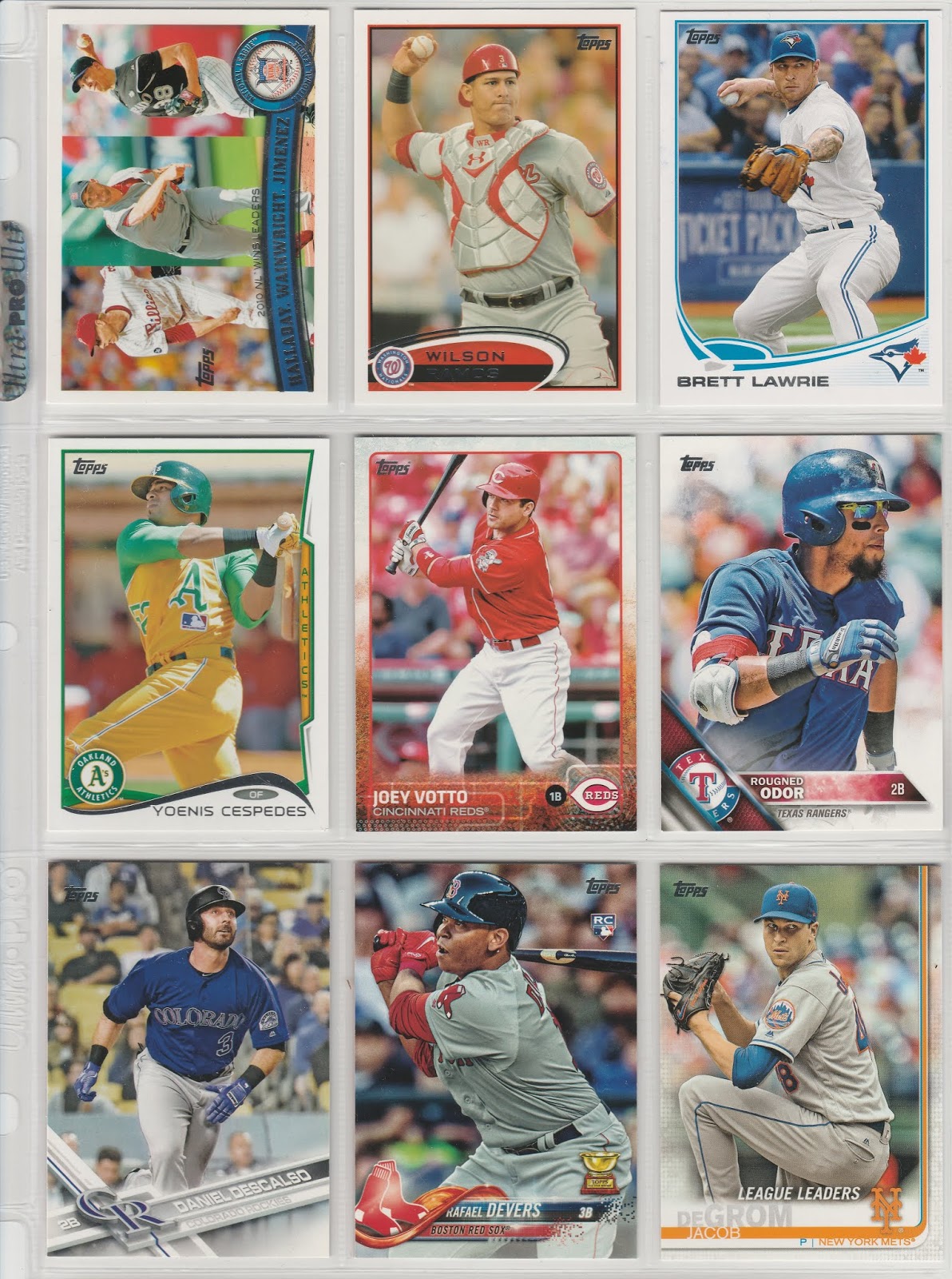
Now we are catching up with the present-day with this series- here is 2011 through 2019. I switched back to double digit numbers to fill this page, which gets us Votto, Devers and deGrom!

Here are the backs, and it looks like Topps has gotten very comfortable with this format- banner on top with name, team, position and card number, followed by a little blurb. A sampling of stats follows, then you've got to give the remaining real estate to the legal department. In my opinion, the 2015 set with its varied colored borders is my favorite of the bunch. The 2019 entry is pretty good too, with a not so subtle nod to the 1982 set. Do you have a favorite set of the 2010s? Do you think the backs are getting stale?
2015 was my favorite set design of the decade. But like you mentioned... I like the 2019 design too.
ReplyDelete2015 is my favorite of the decade as well. I'd like to see another kind of font used for the backs -- just a little something different to change it up a bit.
ReplyDeleteIgnore the comments above, 2011 Topps was the best design of the decade and of the 21st century, and honestly the best design Topps has had since 1987.
ReplyDeleteThere were a lot of great sets this decade. I liked 2010 2011 2012 2015 and 2018 card fronts best. Glad complete statistics have returned to card backs.
ReplyDelete2015 and 2018 were my favorites, though 2011 was the set that rekindled my interest in flagship.
ReplyDelete